Website design and branding for a locations management agency specializing in the film and entertainment industry
Client: The Penny Lane Agency
Project: Website Design
Role: UX Designer & Visual Designer
Team: Katherine Tsui, Daniel Tak, Ye Shen
Tools: Figma, Adobe Photoshop, Illustrator
Time: 3 weeks
The Penny Lane Agency (TPLA) is a locations scouting agency that specializes in booking filming sites for the entertainment industry. In addition to photographs and in-person visits, TPLA also utilizes virtual reality renderings to showcase locations to production executives for filming consideration.
CHALLENGE: Currently, TPLA emails photographs and VR tours of their locations to film production companies upon request. It is a labor-intensive and time-consuming process. Their clients need a more efficient way to view their many location offerings.
SOLUTION: My team designed a website that enables TPLA’s clients - scouts and production executives - to easily access, search and browse through their database of filming locations.
Understanding the User and Context
USER INTERVIEWS - AFFINITY MAPPING - USER PERSONA CREATION - IDENTIFYING PROBLEM
OUR CLIENT
The Penny Lane Agency offers digital marketing services to brick-and-mortar locations to help them grow their business. They also represent these locations to film production companies who need specific types of locations for filming. When production companies are looking for specific types of film locations, TPLA has a database of locations from which to pick. They simplify the booking process of securing these locations for filming.
Because they have minimal web presence, TPLA requested that our team prioritize finding a solution to help their film production clients.
INTERVIEWS
To help us better understand the business of location scouting in film and entertainment, we conducted 9 interviews with industry professionals to learn their current process, tasks, pain points and opportunities for improvement. We talked to individuals who had a part in the process including producers, directors, location managers, and scouts.
AFFINITY MAPPING
With the information gathered from our interviews, we plotted notable value statements onto an affinity map to identify common themes and patterns.
PAIN POINTS
The main goal of location scouting is to find and book sites for filming. Overall, it is a messy, disorganized, time- and labor-intensive process.
A lot of time is spent searching through many different locations which may or may not fit the directors’ vision
Scouts have a checklist of location detail requirements to confirm; oftentimes, information is inaccurate or not current
Communicating between location owners and production companies is hectic, and there is no streamlined way to share plans with the crew
USER PERSONA CREATION
We created a user persona that exemplified the goals and frustrations of the people we were designing for, people who find and book locations for filming.
Meet Alex, a location scout for HBO.
In creating a user persona, it kept our team aligned in making design decisions that addressed the issues of our location scouts.
SCENARIO AND PROBLEM
Alex needs to find and book multiple film locations for a new HBO series that is being filmed. These locations need to meet the director’s vision and the technical needs of the production crew.
How might we help Alex find and book film locations more easily?
We identified requirements to address the problem. Our design solution needs to help Alex through the three main phases of his process: search, learn, and communicate.
COMPARATIVE ANALYSIS
Based on our interviews, we compiled a list of websites that scouts were already using to find locations. A comparative analysis was done to identify flows and features that may help Alex accomplish his tasks, as well as areas we could improve.
FEATURE PRIORITIZATION
My team then plotted these on a prioritization matrix based on their functional value to Alex. Features that we considered high-value and expected would be included in our design. Unexpected and lower-value features would be considered based on the complexity of implementation.
Feature prioritization matrix: expected and high-user-value features will be given priority implementation in the design solution.
EXPERIENCE MAP
In creating an experience map, we considered the features and touchpoints that would be necessary to address Alex’s needs at each phase of his process.
Experience map with considerations for touchpoints and backstage actions at every phase of Alex’s process. (Click map to enlarge.)
USER FLOW
With an understanding of Alex’s process and the features that would be required, we mapped out an ideal user flow to detail the steps in completing his tasks.
INFORMATION ARCHITECTURE
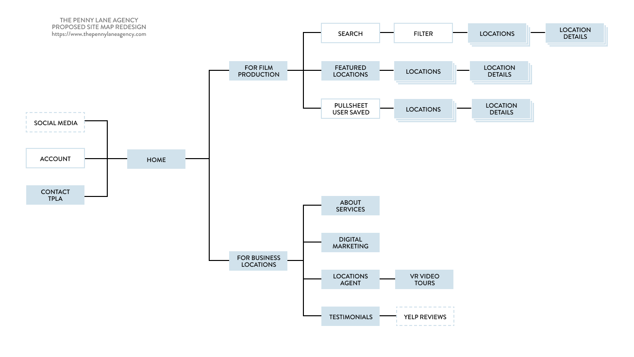
Currently, TPLA has two websites: the SVC Locations website is catered to providing marketing services to their business location clients. Their other website is a basic landing page that instructs film production companies to contact The Penny Lane Agency for more information about their location scouting services.
In the new site redesign, both sides of their business will be combined into one website under the name The Penny Lane Agency. For this sprint, we prioritized creating a user flow for film production companies. Our next sprint, we will focus on the business location flow.
Current site maps for the two sides of our clients’ business.
Site map for the proposed redesign. Both sites are merged into one under The Penny Lane Agency.
SKETCHING WIREFRAMES
Next, our team delved into a brainstorming session and sketched initial ideas for the website. We critiqued each other’s sketches, discussed elements that worked, and then iterated on our designs.
Overall, our sketches were similar to each others because we had open discussions throughout our research and ideation phase. We were aligned in our screen flow. Moving forward, our focus would be on designing the visual hierarchy of the prioritized features within each screen.
My sketches for the landing page, list page and details page.
Teammate Daniel’s sketches for the landing page, list page and details page.
USABILITY TESTING ON MID-FI WIREFRAMES
Once we digitized our sketches into medium-fidelity wireframes, we invited our client TPLA and participants to help us with usability testing. Participants were tasked to browse through locations and contact the agency. Feedback from TPLA and participants informed the next iteration of our design.
PIVOTING OUR DESIGN
Originally, we had aimed to provide all the information that Alex would need to book the film location. However, based on feedback from our client TPLA, we pivoted in our design. TPLA offers high-end customized concierge-style service; their agents work directly with the clients negotiating partnerships between production companies and business locations.
Considering the requests from our client TPLA, we:
removed the option to book locations online
limited the information details of the location
made Contact TPLA CTAs more prominent
HIGH-FIDELITY WIREFRAMES
VISUAL DESIGN & BRANDING
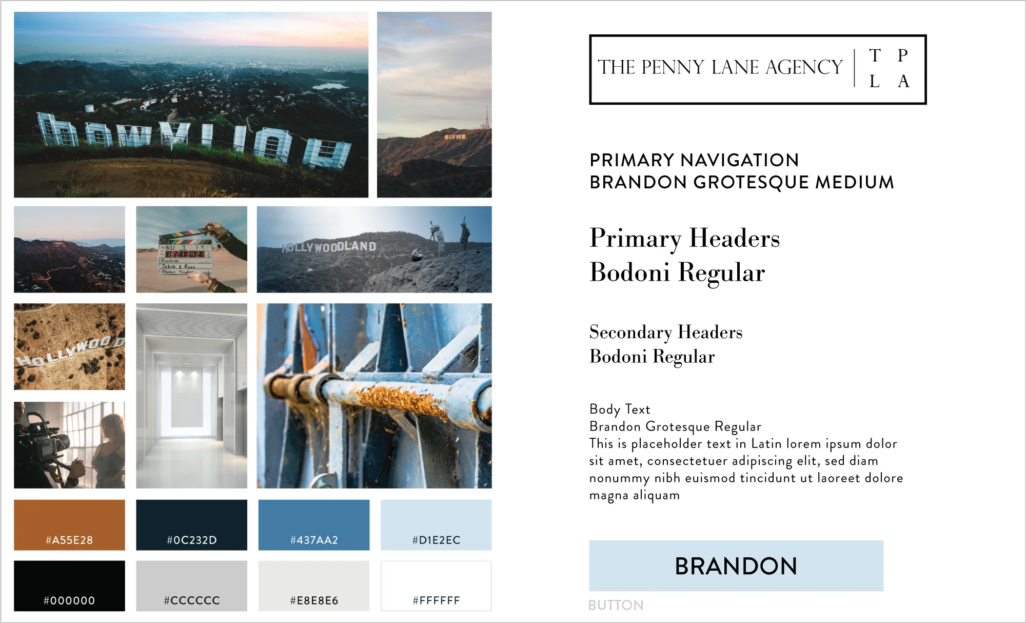
Aesthetics are paramount in the visually-based industry of film and entertainment. We recognized this as an important part of our design and consulted with TPLA in developing their brand. A style guide was created to guide the visual design of our high-fidelity prototype.
Bodoni is a classic typeface that evokes a sense of being sophisticated and established. This was balanced with the sleek and modern typeface Brandon Grotesque. Ample white and minimal splashes of color - muted blues and grays - allows the visual focus to be on images themselves.
THE PROTOTYPE

WHAT’S NEXT?
Build out the other side of the website: marketing services catered towards business locations
Conduct more usability tests, improving upon the design based on feedback
Work with developers to prepare the prototype to be shipped.
WHAT DID I LEARN?
Every client and every project offers new learning opportunities.
Managing expectations. Given the limited time and budget, we worked with our client to prioritize efforts that would be most impactful to the success of their business.
Communication is key. Key stakeholders were not always aligned in the direction of the project. In these situations, it was important to have open discussions with all the key stakeholders involved.


