Project: Mobile App Concept
Role: UX/UI Designer & Researcher
Team: Katherine Tsui, Daniel Tak, Harrison Buckley, George Economou,
Tools: Sketch, inVision, Adobe Illustrator, Photoshop
Time: 2 weeks
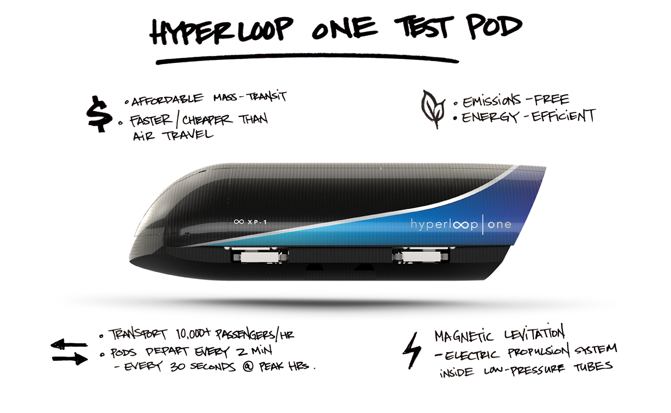
VIRGIN HYPERLOOP ONE will be a new mode of transportation that moves people and freight across long distances at ultra-high speeds. It will be an on-demand mass-transit system that is faster, cheaper than high-speed rail or airline transport.
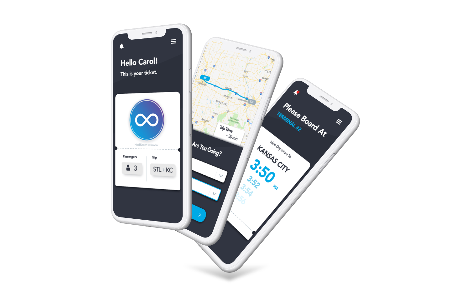
My team was tasked to envision a traveler’s journey from start to finish, and design a mobile ticketing experience that accommodates travelers commuting for business and pleasure.
CHALLENGE: Travelers will need a way to integrate into and navigate through the Hyperloop One system en route to their destination.
SOLUTION: Design a mobile app that guides the traveler through the Hyperloop One system, with considerations for multiple touchpoints they progress through their journey.
What is Hyperloop One?
Still in its early stages of development, Hyperloop One will be a mass-transit system that moves freight and people quickly, safely, and direct from origin to destination. It will integrate with existing transport ecosystem, connecting metropolitan areas around the world. [1]
Understanding the Travelers
SURVEYS - USER INTERVIEWS - FIELD INQUIRIES
AFFINITY MAPPING - INSIGHTS - PERSONAS - SCENARIO
An online survey was sent out to gather information about people’s current travel habits. Of the 68 responses, we learned:
Out of the 68 online responses, we interviewed 8 people who had traveled within the past 3 months by air, rail, and/or ride-hail services. This included field interviews and contextual inquiries with riders at a Los Angeles Metro station. Through interviews and observation, we were able to understand the mass-transit experience for a diverse range of travelers.
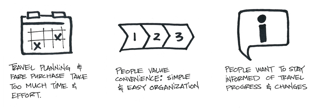
With the information gathered thru surveys, interviews and contextual inquiries, my team analyzed our findings in an affinity map to identify user goals and pain points:
Using the insights from our affinity mapping, we created 2 user personas - Carol and Calvin - to represent the goals and frustrations of our travelers. Designing with Carol and Calvin in mind helped us empathize with travelers, and guide design decisions.
Primary user persona
Secondary user persona
How might we design a seamless Hyperloop One travel experience for Carol and Calvin?
Designing for the Traveler
Comparative Analysis - Feature Prioritization - Card Sort - Journey Map
SKETCHES - WIREFRAMES - USABILITY TESTING - VISUAL DESIGN - HIGH FIDELITY PROTOTYPE
My team conducted a comparative analysis of the ride-purchasing procedures for different modes of travel - including air, rail and ride-hail transport. Doing so allowed us to understand familiar task flows and identify features for consideration.
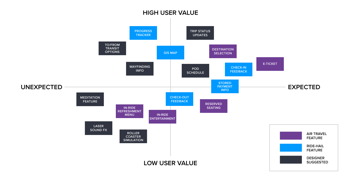
These features were plotted on a prioritization matrix based on their ability to address the travelers’ pain points. What will help our travelers Carol and Calvin achieve their goals? This aligned the team to prioritize the implementation of expected and high-value features.
Feature Prioritization Matrix. We prioritized the implementation of expected and high-value features.
We recruited participants to help us with an open card sort of the considered features. Participants were asked to organize the features into groups that made sense to them. Through this process, we discovered that users want easy access to different features during different phases of their travel process.
Creating an experience map helped us visualize the journey from Carol and Calvin’s perspective, with considerations for various touchpoints. This kept my team aligned in our goals for the travelers, empathize with their motives, and guide our design decisions.
Experience map for both Carol, a first-time traveler, and Calvin, a regular commuter.
At this point, everyone on my team participated in a design studio to rapidly brainstorm, sketch, critique and iterate on initial design ideas for the mobile app. The designs had to accomodate the needs of both Carol and Calvin.
Carol and her kids are first-time riders who need account creation, instructional and navigational guidance.
Calvin is a regular commuter; he needs fast, easy, seamless travel.
Whiteboard sketches of mobile screens from our design studio session.
Elements that the team considered most effective were then incorporated into a paper prototype. This was used to run usability tests on 7 participants.
Paper prototype for first round of usability testing
One of our earliest features included a payment system that would automatically track and charge travelers for their ride. This idea was built upon published articles that Hyperloop was exploring the possibility of a payment system that uses biometric sensors, near field communication, and blockchain technology. [2]
My team was not aligned in our decision to proceed in this direction. To better guide our design with a focus around the user, we created a quick mockup and conducted usability tests with 12 participants.
Key findings: users are uncomfortable with being tracked by the system. They want a sense of control when checking in and out.
Features on the mobile app are intended to change dynamically as travelers Carol and Calvin progresses along their journey in the Hyperloop One system. However, during the following round of usability tests, we realized that participants struggled to understand the screen flow from their static testing environment.
To troubleshoot our usability test, my team rearranged a presentation room to create a “portal simulation”. This included a portal entry, terminals, scanners, touchpoints, and external environments thru which the travelers move when traveling by Hyperloop One.
A low-fidelity Hyperloop portal simulation for usability tests.
This proved to be a crucial part of usability testing the medium-fidelity prototype. The portal simulation helped participants contextualize the screen progression as it guided them through the space. Participants were able to provide valuable feedback for the next iteration of our mobile app design.
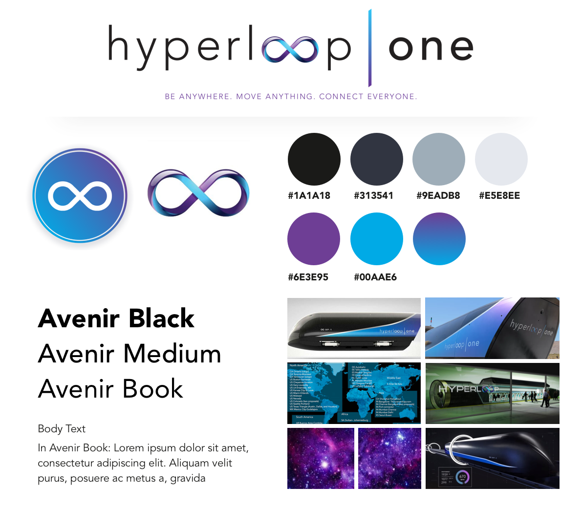
To help with the visual design of the high-fidelity prototype, we created a style guide that reflects Virgin Hyperloop One’s latest pod prototype and logo redesign: sleek, high-tech, and futuristic.
From the typography to color choice to layout composition, the guide served as a reference to ensure that our high-fidelity prototype maintained consistency with Hyperloop’s existing branding.
DEVELOPER FEEDBACK
My team and I consulted with Abraham Hsu, developer, and Bryant Cabrera, software engineer, to get feedback on our proposed design.
Feasible: overall front-end development
Significant time + resources required: backend development, whole-system integration with mobile devices, touchpoints, progress-tracking, scalable data storage capacity
Existing NFC tech can be used to integrate, track and communicate with travelers within the Hyperloop system
WHAT’S NEXT?
Features for consideration: reserved seating, frequent commuter pass, transit options to/from the portal
Continue to work with developers and engineers ensure feasible designs
Keep testing, learning and iterating
WHAT DID I LEARN?
Fail early, fail fast, fail often. But more importantly: learn from failure and reiterate.
Disagreement within the team on how to proceed? Put it to a usability test with users!
Encourage open communication from different perspectives. Some of the best ideas came from open and frequent communication, where everyone was encouraged to share ideas.


